The Workforce Health dashboard is your organization-level view of employee wellness. It combines individual wellness data into a single Org Wellness Score, provides AI-generated insights streamed in real time, and lets you drill down into employee-level, department-level, and team-level breakdowns.
Overview
The Workforce Health dashboard answers one question: How healthy and engaged is my workforce?
It does this by aggregating data from every employee into a composite wellness score (0-100) and presenting it alongside actionable insights and drill-down reports.
Note: The Workforce Health dashboard is not a self-serve feature. Your Vantage Fit account manager has to activate this feature for you.
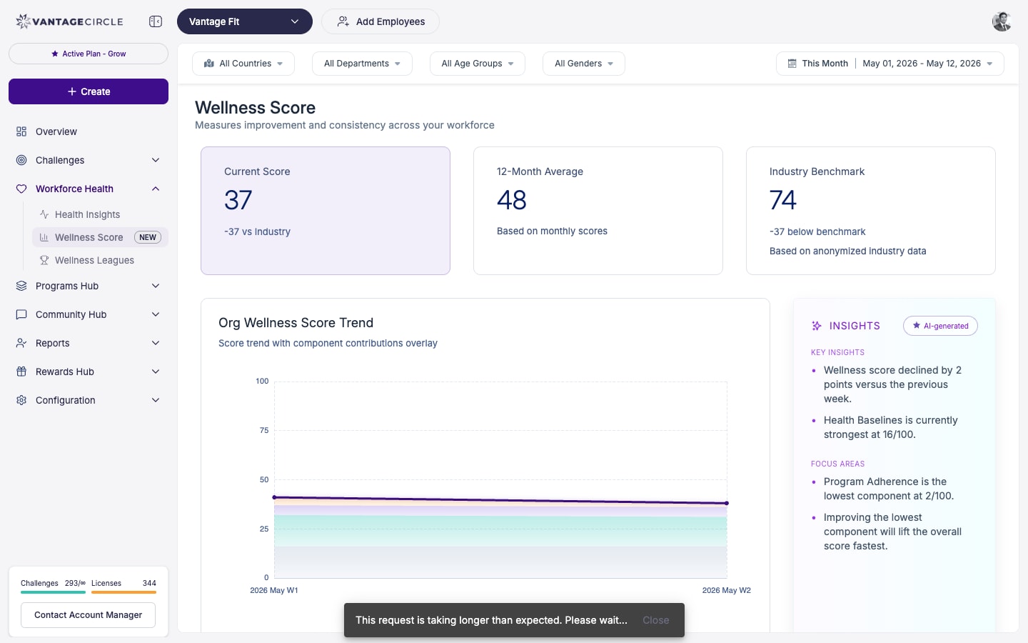
The Org Wellness Score
At the top of the Workforce Health page, you will see the Org Wellness Score — a single number from 0 to 100 that represents the overall wellness health of your organization.
How It Is Calculated
The score is built from four components, each weighted to reflect its importance:
| Component | Weight | What It Measures |
|---|---|---|
| Baseline | 20% | Health fundamentals from the Health Risk Assessment (HRA) — BMI, blood pressure, chronic conditions, lifestyle factors |
| Participation | 30% | Daily engagement — are employees opening the app, logging activities, joining challenges? |
| Activity | 30% | Physical effort and improvement — steps taken, workouts logged, calories burned, trends over time |
| Adherence | 20% | Challenge compliance — are employees completing assigned tasks and maintaining habits? |
Each component is scored 0-100 individually. The weighted average of all four produces the final Org Wellness Score.
Tip: A balanced score across all four components is healthier than a high score driven by just one. If Activity is 85 but Participation is 40, employees who do participate are very active — but too many employees are not participating at all.
Streamed Real-Time Insights
Below the score, the dashboard presents AI-generated insights that are streamed in real time. These are automatically generated observations about your wellness data, such as:
- "Participation dropped 15% this week compared to last week."
- "Engineering department has the highest Activity score but lowest Adherence."
- "Monday is your most active day; Friday engagement drops 30%."
- "3 departments have no active challenge participants this month."
These insights help you spot trends and take action without manually analyzing data.
Employee-Level Wellness Score Report
Drill down from the org-level score to individual employees:
- On the Workforce Health page, scroll to the Employee Wellness Report section.
- Each employee shows their individual wellness score (0-100).
- Click on an employee to see their component-by-component breakdown:
- Baseline score
- Participation score
- Activity score
- Adherence score
Exporting Employee Wellness Data
Click Export CSV to download the full employee-level wellness report. The export includes:
- Employee name and email.
- Overall wellness score.
- Per-component scores (Baseline, Participation, Activity, Adherence).
- Department and country.
Note: Individual wellness scores are intended for aggregate program analysis and targeted interventions — not for individual performance evaluation. Use this data to improve your wellness program design, not for HR decisions about specific employees.
Department and Team Breakdowns
The Workforce Health dashboard provides breakdowns by:
Department View
Compare wellness scores across departments. This helps you:
- Identify departments with low engagement that need targeted challenges or communication.
- Recognize high-performing departments.
- Allocate wellness resources where they are needed most.
Team View
If team challenges are active, see wellness scores by team. This reveals:
- Which teams are most engaged with wellness activities.
- Whether team-based challenges are driving participation.
Location View
Compare wellness metrics across countries or cities. Useful for global organizations with different wellness patterns by region.
Trend Analysis
The Workforce Health dashboard shows how your wellness metrics change over time:
- Weekly trends — how the Org Wellness Score has moved week over week.
- Monthly trends — longer-term view for quarterly and annual reporting.
- Component trends — track each of the four components independently over time.
Trend data is essential for answering "Is our wellness program working?" If the score is trending up over months, the answer is yes.
Enabling the Workforce Health Dashboard
The Workforce Health dashboard must be activated for your company by your Vantage Fit account manager.
To get it enabled:
- Contact your Vantage Fit account manager.
- Request Workforce Health / Org Wellness Score activation.
- Your account manager configures it for your company.
- Once enabled, data begins accumulating immediately.
- Allow 2-4 weeks of data collection for a reliable baseline score.
Tip: Enable the Health Risk Assessment (HRA) alongside the Workforce Health dashboard. The Baseline component (20% of the score) relies on HRA data — without it, this component will be less meaningful.
Lab Reports and Annual Health Check-ups
For organisations that run annual health check-ups for employees, Vantage Fit supports two paths for getting lab data into the platform:
- Employee self-upload — employees upload their own lab report PDFs from the app. Biomarkers are extracted automatically. See How Do I Upload Lab Reports? for the employee-side flow.
- HR bulk upload — for companies running organisation-wide health check-up programs (e.g. an annual on-site or partnered diagnostics drive), HR can bulk-upload employee lab reports. This is set up by your Vantage Fit account manager — contact them to enable it for your company.
Once reports are in the system (whether employee- or HR-uploaded), biomarker extraction runs automatically, and aggregate organisational insights — common biomarker risks, prevalence of conditions, departmental patterns — surface in the Workforce Health dashboard alongside the wellness-score components.
Note: Individual lab data is always protected. Admins only see aggregate, anonymised insights at the organisation, department, and country level — never individual employee biomarker values. Each employee retains private access to their own report and biomarker breakdown.
Best Practices
- Review monthly, not daily. The Org Wellness Score is a trend indicator. Daily fluctuations are noise; monthly patterns are signal.
- Use component scores for diagnosis. If the overall score drops, check which component drove the decline and respond accordingly — launch a challenge for Activity, send reminders for Participation, etc.
- Share the top-line score with leadership. The single-number Org Wellness Score is perfect for executive reporting. Keep it simple at the top level and provide component details on request.
- Act on the insights. The streamed insights are only valuable if you respond to them. When the system tells you Participation is dropping, that is your cue to take action.
- Combine with challenges. Design challenges that target your weakest component — a Streak challenge boosts Adherence, a Race boosts Activity, a content-heavy Custom challenge boosts Participation.
- Export quarterly for stakeholder reports. A quarterly wellness report using exported data demonstrates program ROI to leadership.
Need more help? Contact your Vantage Fit account manager or email support@vantagecircle.com.
Related articles: